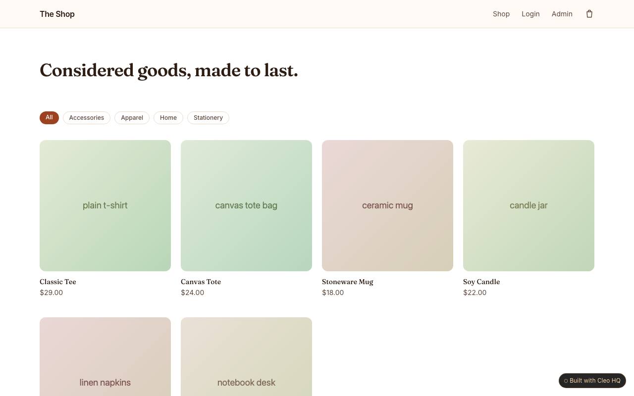
What should shoppers be able to compare in the product grid?
Give each product a recognizable image, name and price, with enough detail to distinguish similar items. Category browsing can reduce the work when a catalogue grows, but categories should match how customers think about the products. The example links the grid to detail pages; let a shopper open an item without losing their place in the catalogue.
What should a guest cart show before checkout?
Show the selected items, quantities, prices and order total, and make it easy to remove or change a choice. If shipping or taxes are calculated later, explain that before the customer pays. The sample lets visitors use a cart without signing in; preserve their choices through the checkout step and provide a clear correction path.
How can a store make delivery expectations clear?
State where the shop ships, how delivery costs are calculated, and what timing customers can reasonably expect. If processing time differs by product, explain that on the item page rather than relying on a general policy. The example covers a single seller’s storefront; keep order confirmation consistent with the actual fulfilment process.